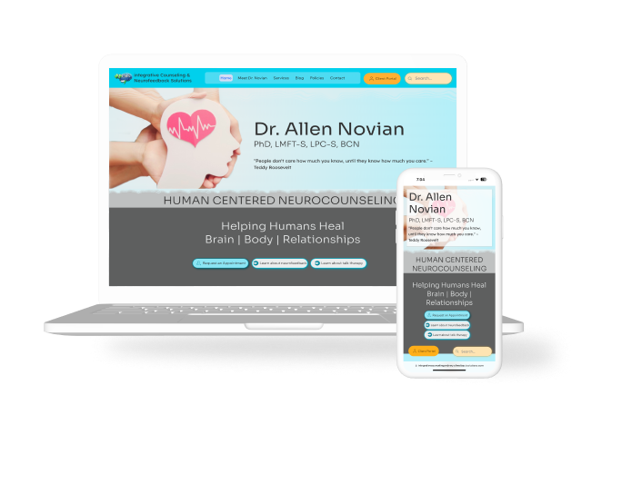
Responsive website improves conversion rate by 60%
Healthcare clinic with specialized services needed to convert clients without 45 minute intro calls.
Potential clients needed to understand the office's services, prices, and private pay status.
A responsive website with a focus on designing for distress was the solution that worked.

.png)
clarity brings conversion
expand
Conversion requires a strong call to action. Using primary buttons for the "Request an Appointment" CTA throughout the design improved click through rate by 27% over one month.
Getting results from therapy is 80% dependent on the rapport created within a therapeutic relationship.
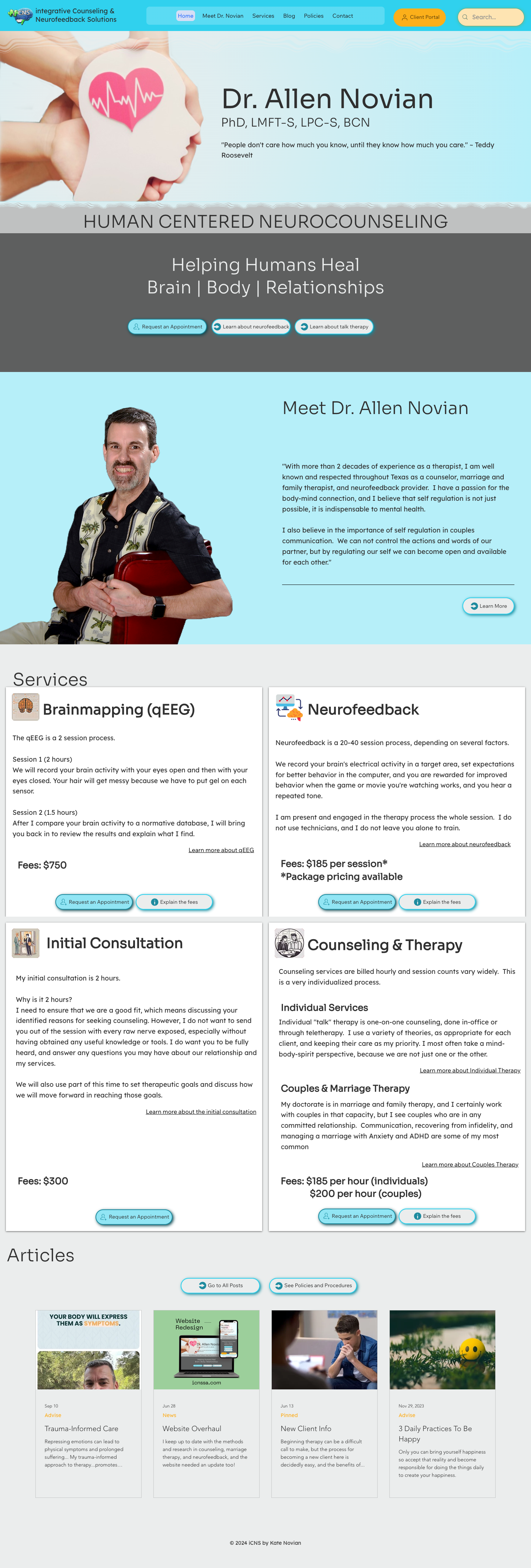
Having the provider's face, and a personal message from them front and center engenders a feeling of transparency and trust.
.png)
Original Homepage Design
.png)
New Homepage Design
Mental healthcare is hard to seek out
No one likes admitting they need help, so make it easy.
Imagine you're a parent seeking mental health services for your child, teen or young adult who... well... isn't doing very well.
The main question on your mind isn't "How cool does the therapist's site look?" The site needs to focus on answering the 3 main questions on your mind:
- "How much will this cost?"
- "Can I trust the provider?"
- "What approaches or services are offered here?"
Answering those questions builds confidence, presents the clinic's commitment to transparency, and reduces phone consultation time by an average of 23 minutes.
How am I going to afford this?
Can I trust this provider to take care of us?
Do these services match what I need?
Research
- how do new clients used the site to reach a decision
- what they needed to see first
- because the services are specialty, what concerns do they have
Prototype
- Workflows to wireframes
- Wireframes to prototype
- Fully functional interactive prototype
Test and iterate
- usability testing
- A/B Testing
- analytics
- use findings to enhance design prior to development
Ongoing research illuminates trends over time
We maintained a product lifecycle of quarterly website iterations and major redesigns on a biannual basis. This design cycle allowed us to maintain a sense of stability, since return users are common for this company, while allowing a refresh and sense of vitality as the provider adjusted his desired clientele and service focus. It also alowed us to follow current design trends.
I tracked questions in incoming calls and through follow up surveys with perspective clients for 6 weeks every year from 2008-2023. I looked for themes, common questions, and primary emotional pain points. I always asked "What made you call us, instead of one of the other clinics in town?"
As the familiarity with the specialty services provided by the clinic and the clients' priorities changed over the years, the site needed to change with them.

Building trust had to start with consistency and information architecture
In the 2021 version of the site, the company's focus had been on showing the variety of different services and clientele that were served here, but the result created a sense of disorientation, which meant that most people either bounced from the site or just called the office to ask their questions. The average time on the phone with the provider or office staff was more than 40 minutes.
The information was THERE but no one was willing to search for it.
Our solution:
Build Trust- describing the service provider's approach through a famous quotation, followed by a personal message from the provider
Display cost- prominently display the costs and explain why without the prospective client having to hunt around for it
Create a clear Call To Action (CTA)- by giving users a defined and consistent direction to request an appointment.


Final Thoughts
What I learned, what happened to the project, and what I would have changed.
Usability Testing introduced new insights
Prior to launching the new design, I conducted usability testing with current clients of the clinic, as well as A/B Testing with trusted professionals and members of the general public. The results helped us correct problems before the site was live, but they also provided me with new insights to a problem that had been a blind spot.
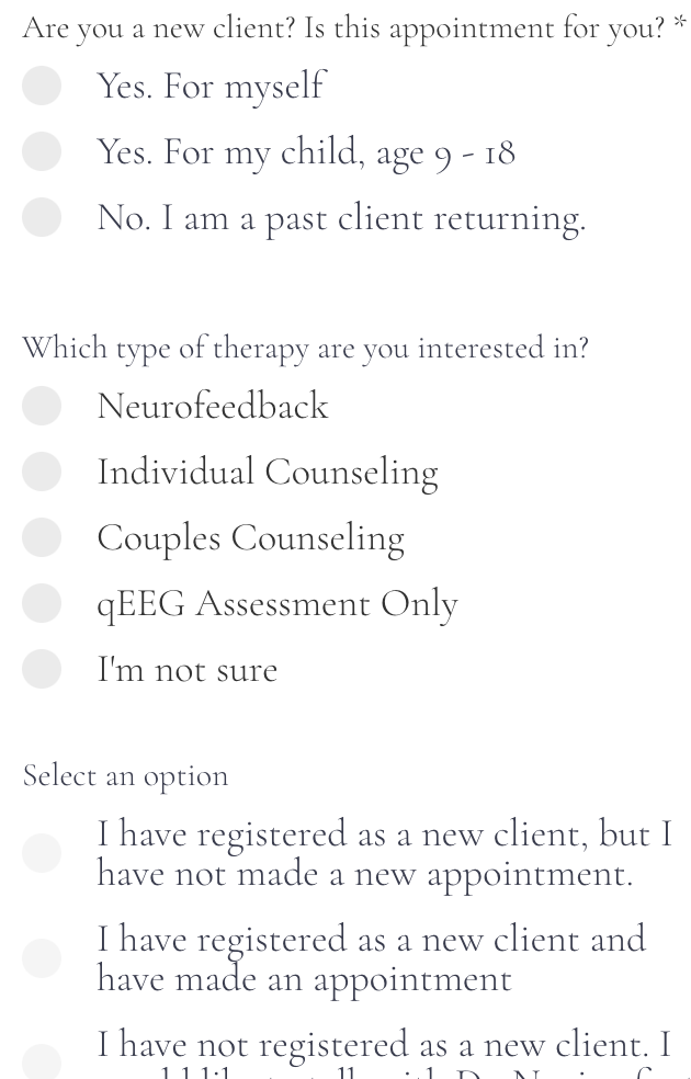
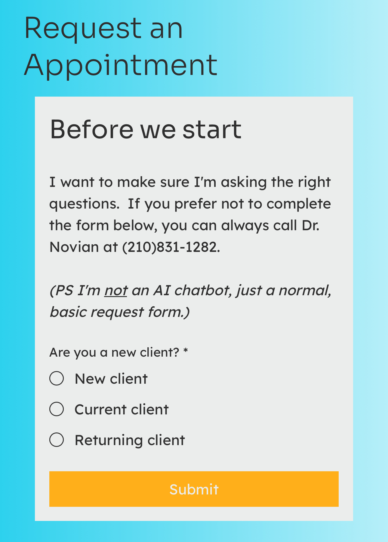
The form that had been used to generate new client leads was long, asked too many questions, some of which were not relevant to all users, it was hard to find, and most users abandoned the form and opted to request an appointment by calling rather than through the online form. This caused an inefficient use of the staff's time.
In an effort to correct this issue, my team and I redesigned the form with conditional logic in an effort to ask only the questions that the user would find immediately relevant. I conducted a workshop with the 2 interns and 3 staff members I had on my team in order to brake the information into small pieces. The result is that the clinic receives 60% of its' new client requests from the website, and relevant information about the client saves approximately 3.5 minutes of the clinician's time per new client who converts through the form.
